
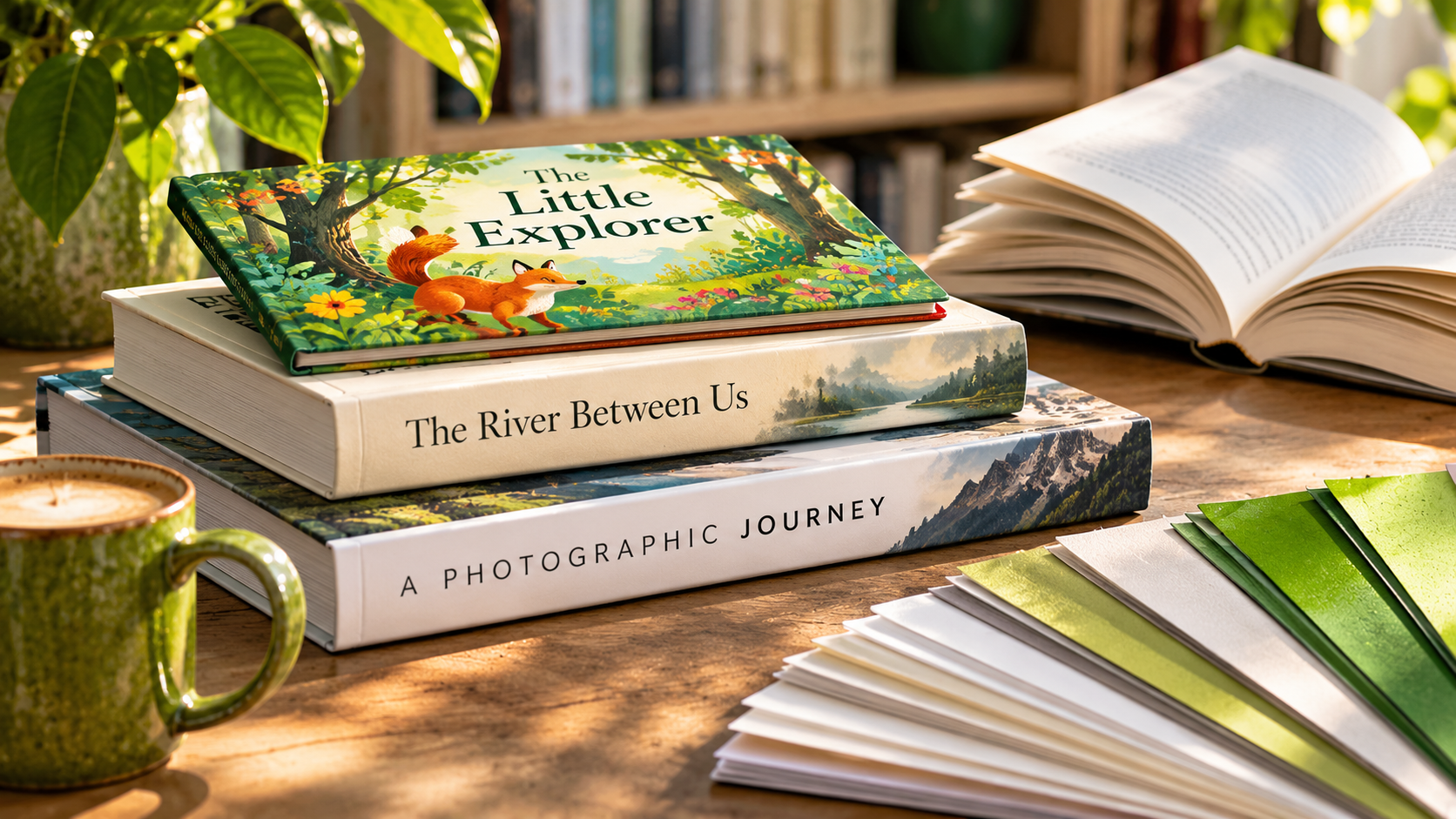
A children’s picture book, a gripping novel, and a beautiful coffee table book of photography all have very different jobs to do. And while the words and images are obviously the star of the show, the physical book needs to support them.
That’s why choosing paper for books isn’t simply a matter of selecting a stock you like the look of. It’s about understanding who’s going to read your book, how they’ll use it, and what you want the finished publication to feel like.
Before we start exploring different paper weights and finishes, there’s a useful first question I always ask: who are we producing this book for?
Think about a picture book for young children for example. It’s likely to be opened repeatedly, handled enthusiastically, and perhaps subjected to the occasional sticky finger or two! Therefore, durability matters as much as making the illustrations engaging and the pages easy to turn.
Now, consider a 400-page novel. Readers might spend hours holding it, so weight, flexibility and a comfortable reading experience become important considerations.
An art or photography coffee table book presents a different challenge. Here, the way the paper reproduces colour, contrast, and fine detail will likely be central to the experience.
What’s important to understand here is that the right specification isn’t necessarily the most impressive one – it’s the one that makes your book work for its reader.
Genre gives us a useful starting point, although there’s rarely one perfect paper for every book within a particular category. Let’s take our fiction, children’s and coffee table books again as examples.
For fiction, an uncoated stock in a natural or cream shade can provide a comfortable reading experience. Paper weight and opacity also matter, particularly in longer books where we want to avoid unnecessary bulk without having text from the reverse side becoming distracting.
Children’s books often benefit from stronger, more durable materials, especially when illustrations play a major role. There’s a big difference though between a board book for toddlers and a beautifully illustrated storybook for older children, and the production choices should reflect that.
For coffee table books, coated papers are often considered because they can reproduce sharp detail and vibrant colour. However, an uncoated stock might be exactly right for a particular artistic style, especially if a softer, more tactile result is part of your creative intention.
The World Bank’s technical guidance on producing reading books also highlights how considerations such as paper opacity, surface, and intended use influence production choices.
And that’s really the point. We’re not choosing paper in isolation; we’re choosing how the content will be experienced.
We all know the saying about not judging a book by its cover, yet the reality is that covers create expectations.
A textured matt finish might feel appropriate for a thoughtful literary novel, while a vibrant gloss finish could suit a colourful children’s title. And a specialist finish might give a limited-edition publication a particularly distinctive character.
Binding plays its part too. A perfect-bound paperback may be entirely appropriate for a novel, while a case-bound hardback could be better suited to a gift edition or a book intended to be kept and treasured.
However, I’d be cautious about assuming that hardback automatically means better, or that adding a premium finish will improve every book. The cover and binding needs to feel like a natural extension of what’s inside, rather than something chosen simply because it looks expensive.
This is where having someone experienced involved makes a real difference.
It’s easy to become excited by beautiful paper samples, unusual finishes, and specialist binding techniques. And, of course, there’s absolutely a place for those things!
However, every choice has a cost, and the important question is whether that additional investment contributes something meaningful to your finished book.
Perhaps a photography publication genuinely needs a particular paper to reproduce its images faithfully. In that case, spending more on the internal pages may be worthwhile. But for a novel, a carefully selected standard stock could give readers everything they need, leaving more of your budget available for a distinctive cover.
Choosing the cheapest option without considering how it will perform can lead to disappointment. Because, good value isn’t about spending the least, it’s about spending where it makes the biggest difference.
One thing I’d encourage any author or self-publisher to do is look at the proposed specification as a whole, rather than making each decision separately.
And all those choices have implications for production costs.
This is where our Print Wisdom® really comes into its own.
We can explore the creative intention behind your book, consider the practical production options and help you make informed choices that work together, rather than discovering too late that a particular combination isn’t suitable.
Sometimes the most valuable advice we might give is to invest in a particular detail. At other times, it’s explaining why a simpler approach could work just as well.
Whether you’re an independent author preparing your first publication or an established self-publisher developing your next title, the decisions you make about paper, finishing and binding deserve careful consideration.
Because when your physical book feels right for its content and its reader, everything works together to create the experience you intended.
If you’re planning a publication and would like some expert advice on choosing the right print specification, get in touch – we’d love to support you.
Enjoyed this blog and want more ideas and inspiration? Visit our Print We Love page where we regularly share more knowledge and expertise on print marketing and production.

Gill Robinson
23rd October 2026




 by PAGE